APCA
APCA
⇦ HOME ⇧ UP ONEThe Easy Intro to the APCA Contrast Method
Visual readability is a key part of web content, affecting 99% of internet users. For years, the WCAG 2.x contrast standard provided basic guidance for designers. Today, WCAG 2.x contrast is out of step with modern technology, and needs a replacement. Here is an overview of the need for this change, and the candidate replacement.
Introducing the Accessible Perceptual Contrast Algorithm (APCA).
The Contrast Problem
WCAG 2.x contrast guidelines were born in an era before smart phones and iPads. Displays were bulky, old-school CRT type, and websites used core web fonts. But that was a decade and a half ago. Today, the contrast guidelines are in need of a complete overhaul. Advances in display technology and vision science render WCAG 2.x contrast obsolete.
There are many reasons that WCAG 2.x contrast is faulty. The simplistic pass/fail nature of the guideline does not serve the range of human perception, regardless of impairment. Humans are not binary computers, rather we perceive over a range. And our perceptions are non-linear, sensitive to context, and not absolute.
Effective guidelines calculate contrast with uniform results, for consistency across the visual range. Non-uniform methods such as WCAG 2.x need “brute forced” arbitrary values. These simplistic, forced thresholds, ultimately do more harm than good.
Let’s review the basics of color and contrast with the summary below. For a deeper-dive, see the author’s overview, “The Realities And Myths Of Contrast And Color”.
REVIEW: Vision and Impairments
There are many kinds of visual impairment we may experience over the course of our lives. Different impairments can affect our acuity, contrast, or color perception in varying amounts. Impairments can arise from genetics, disease, medications, injury, fatigue, age, and environmental conditions. These factors can create problems anywhere from the eye’s lens, the light sensitive retina, through to the brain.
-
Visual Acuity (VA). VA refers to the ability to focus the eyes on a small item, to a sharp clear image. An acuity impairment limits how small an item we can focus on. An eye doctor can prescribe glasses or contacts, or perform surgery, to improve acuity. One way we can help accommodate acuity problems is to make things bigger.
-
Contrast Sensitivity (CS). CS is our ability to detect edges, lines, & letters against a background. CS is separate from acuity, and we can have good acuity with poor contrast sensitivity. We can improve our contrast perception by increasing the light on the subject. On a computer screen, we can increase the difference between a darker and a lighter color.
-
Color Vision Deficiency (CVD). CVD is a reduced ability to distinguish different hues of color. (Sometimes called “colorblind”). Those with CVD have as good or better vision and contrast sensitivity, as standard vision. Thus, CVD does not impact readability per se. But CVD affects visual tasks such as reading a map or charts (dataviz), due to the need to discriminate colors (hue).
What Is Visual Readability Contrast?
Like color, contrast is not “real” in an absolute sense, it is a perception. It is how your brain interprets visual differences for the surrounding visual information. Contrast is not a simple measure of the difference between two colors.
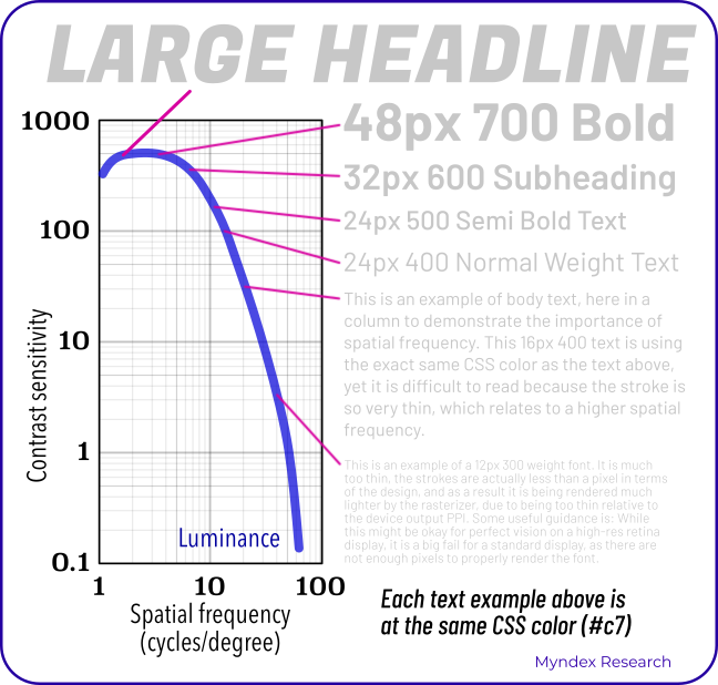
Like all perceptions, contrast between two colors is sensitive to context. This means the other items around it affects how you see it. The “spatial characteristics” of line thickness or text weight & size, govern our contrast sensitivity. These are the principal factors in our perception of visual contrast of lightness/darkness. (Sometimes referred to as luminance contrast).
For readability, we need ample lightness-contrast, disregarding color as in hue. Color contrast, meaning hue/saturation, does not play a major role in readability. But ample lightness/darkness contrast enables fluent readability at best speed and comprehension. This is especially true for small body text, such as in columns or blocks.
Above a certain amount, critical contrast constancy may come into effect. This means that increases beyond critical contrast do not result in better readability. A high “spatial frequency” means smaller and thinner letters. Smaller, thinner letters or graphics lowers the perceived contrast. To compensate for small, thin fonts, increase lightness/darkness difference of text & background.
-
The contrast sensitivity threshold (CS) is the point of “just noticeable differences” (JND). That is, the point between visible and invisible.
-
Fluent readability refers to critical contrast. This is the smallest amount needed for best reading speed and comprehension. Peer-reviewed science tells us¹ contrast should be at least ten times the JND. The preferred contrast reserve is twenty times threshold for best fluent reading.
-
Spot readability means readable without significant effort. Spot reading is the lowest readable level, where the contrast needs to be three times the JND. This low level is useful for disabled controls, copyright bugs, and other non-content.
These factors define the area of “supra-threshold critical contrast for readability.” We refer to this as “readability contrast” for simplicity. There’s a critical font size for acuity, and a critical Lc value with font weight for spatially-driven lightness-contrast.
The size of a font relates to a person’s ability to focus (defined by a number like 20/20 or 6/6 on an eye exam chart). Both the size and weight of that font defines contrast sensitivity. Contributing to contrast is white space, letter & line spacing, font aspect ratio, etc.
The following chart demonstrates the spatial nature of human contrast sensitivity. The text samples connect the abstract science of the CS curve to practical reality.
Use Cases
Spot-reading-contrast has a lower requirement than fluent readability contrast. Non-text object contrast, such as for a solid icon, may have a lower contrast need. Color (hue or saturation) is important for coding information, such as dataviz. Even so, luminance contrast is still required for visual details.
No single figure (such as 4.5:1 or 3:1) is useful as a blanket target for contrast between two colors. Without considering the use case, size, thickness, etc., such ratios are not instructive. On this point, studies have shown that WCAG 2 contrast may pass colors that should fail as not readable. These studies also show that the WCAG 2 math may fail a color pair that should pass as very readable.
Contrasting Concerns
The problem of 4.5:1 as a target for a guideline not only impacts accessibility, but impacts standard vision. The inherent problems with the WCAG 2 contrast math have been widely criticized. Including studies by others showing that color insensitive types are not well served. The WCAG 2 contrast specs often cause enough problems for designers that it is ignored. Today, some 86% of websites are failing WCAG 2 contrast. Some failures are not due to poor accessibility, but instead due to the incorrect math of WCAG 2 contrast.
The Solution: APCA
APCA is a new method for calculating and predicting readability contrast. An acronym for the Accessible Perceptual Contrast Algorithm. APCA is a part of the larger S-Luv Accessible Color Appearance Model known as SACAM (formerly SAPC). These models predict color appearance on self-illuminated RGB computer displays & devices. They model accessible user needs, with a focus on readability.
Lightness contrast (Lc)
APCA generates a lightness contrast value for a minimum font weight, size, and color pair. This value is uniform to lightness/darkness perception. Regardless of how light or dark the two colors are, a given contrast value is visually consistent. Thus, Lc 60 represents the same perceived contrast, for the range of available colors.
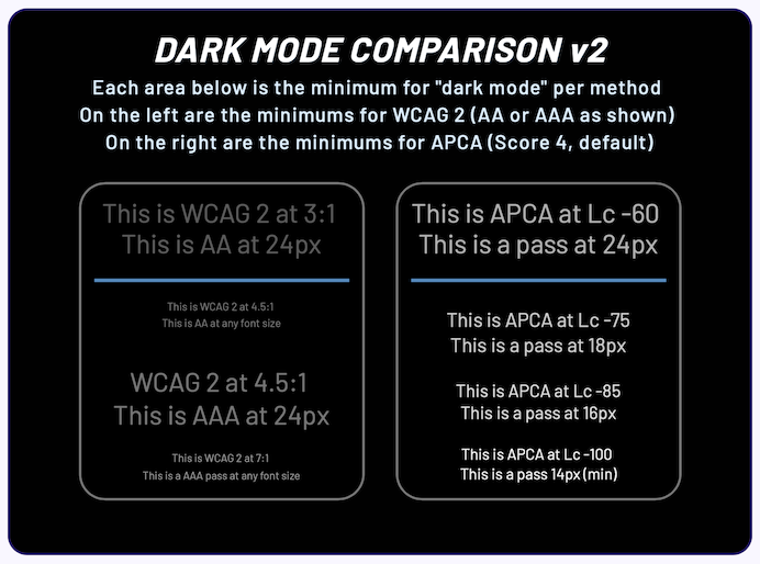
This is absolutely not the case with WCAG 2.x, which far overstates contrast for dark colors. The WCAG 4.5:1 ratio can be functionally unreadable when a color is near black. As a result, WCAG 2.x contrast cannot provide useful guidance when designing “dark mode”. This deficiency also creates problems for color vision deficiency (sometimes called colorblind).
The APCA lightness contrast value (Lc) is perceptually uniform. The Lc value has a direct relationship to the spatial contrast sensitivity curve. Halving or doubling the APCA value relates to a similar change in perceived contrast. There is a subtle weighting for higher contrasts with smaller, thinner fonts. There is also a mild contrast boost for very dark colors, to offset common ambient lighting.
Different Uses, Different Contrasts
The APCA Readability Criteria has a basic set of levels, related to use cases. For instance, Lc 90 is preferred and Lc 75 is the minimum for body text. This makes it easy to use APCA, very much like WCAG guideline 1.4.3 for ease of use.
APCA also has an optional lookup table, associating font weight to the contrast value. The lookup tables allow for greater accuracy and thus greater flexibility in design.
Failing Pass/Fail
One lesson learned, is a strict pass/fail with a blanket contrast ratio is not instructive as a guideline. The lack of uniformity leads to forced thresholds, serving neither user nor designer. In fact, user needs when it comes to contrast are often conflicting—what is good for one can be harmful to another. This is even true of font size and weight.
This points to the importance of real user personalization. Today, the automated technology for personalization is in its infancy. The introduction of perceptual uniformity in color and contrast serves an automated workflow. APCA’s uniformity, spatial awareness, and polarity sensitivity, combine to serve automated workflows.
Today, APCA Readability Criterion provides robust guidance for making content readable for all.
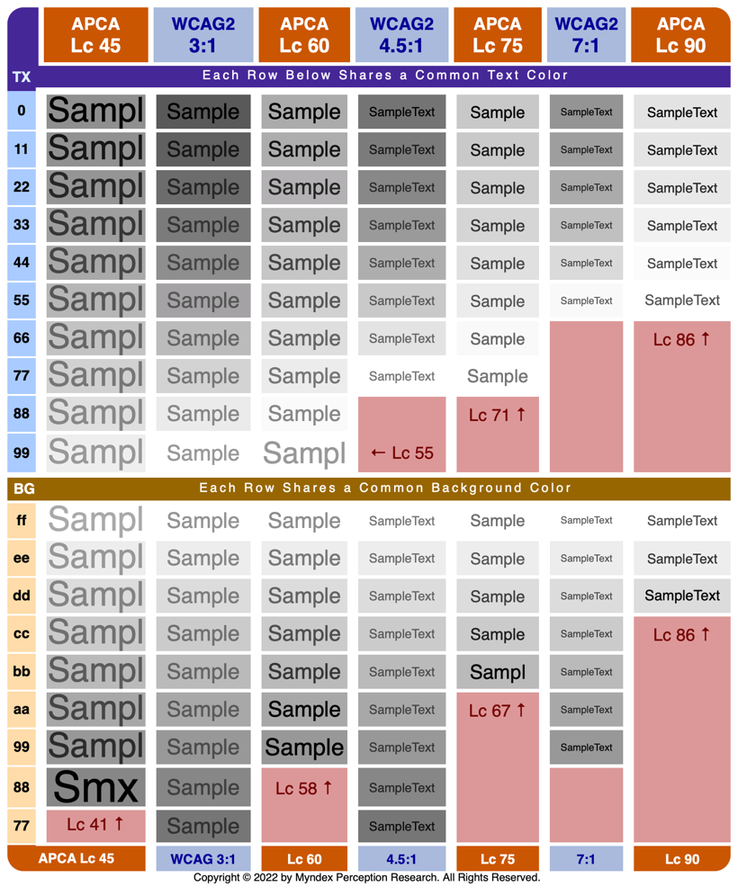
Visual Comparisons
In the following chart, we’re showing minimum passing contrasts for APCA and for WCAG 2. Notice WCAG 2 examples become unreadable with dark colors.
And the problem is particularly severe for “dark mode”:
Use-Case Ranges
These general levels are usable without the need to reference a lookup table. APCA reports contrast as an Lc value (lightness contrast) from Lc 0 to ±Lc 106. For accessibility, Lc 15 is the point of invisibility for many users. This is especially true for thin lines or borders. Lc 90 is the preferred minimum for columns of body text. See this on ranges for a more in-depth look.
The values below based on the reference font Helvetica or Arial.
-
Lc 90 - Preferred level for fluent text and columns of body text with a font no smaller than 14px/weight 400 (normal).
-
Lc 75 - The minimum level for columns of body text with a font no smaller than 18px/400. Consider Lc 75 as a minimum for text where readability is important.
-
Lc 60 - The minimum level recommended for content text that is not body, column, or block text. In other words, text you want people to read. The minimums: 24px normal weight (400) or 16px/700 (bold).
-
Lc 45 - The minimum for larger, heavier text (36px normal weight or 24px bold) such as headlines. This is also the minimum for pictograms with fine details.
-
Lc 30 - The absolute minimum for any text not listed above. This includes placeholder text and disabled element text. This is also the minimum for large/solid semantic & understandable non-text elements.
-
Lc 15 - The absolute minimum for any non-text that needs to be discernible and differentiable, and is no less than 5px in its smallest dimension. This may include disabled large buttons. Designers should treat anything below this level as invisible. Less than Lc15 will not be visible for many users. Avoid less than Lc30 for anything important for the use, understanding, or interaction of the site.
These define the basic minimum levels, what you might think of as A/AA in the old WCAG 2. For AAA, simply increase the contrast values by Lc 15.
Dark Mode Maximum: Lc -90 for large fonts (preliminary).
Range-Based Scoring
APCA as the candidate for WCAG 3 is still in development. It includes a range-based conformance system. While APCA considers many factors, it is simple enough to be fully automated. APCA does not rely on an arbitrary pass/fail binary scoring, nor brute-forced thresholds.
The approach improves design flexibility and readability at the same time. Readability is improved by increasing contrast for body text, where it is most needed. Design flexibility is achieved by relaxing contrast for large non-text elements. Large/thick elements do not need brute-force contrast levels, due to their larger size.
The demonstrator tool provides real-time updates of minimum font size & weight vs Lc lightness-contrast. apcacontrast.com The tool has several ways to enter a color. Click on the color patches to bring up a color-picker, enter a hex value or an RGB value, or use the sliders. The text color supports alpha. A negative Lc value, such as Lc -60 means the text is lighter than the background. A positive value Lc 60 means the text is darker than the background (light mode).
We hope this clarifies the advantages of a perceptually uniform range-based contrast model. APCA enables content with improved visual readability—we can make reading fun again!
Thank you for reading,
Andrew Somers
Director of Research
Myndex Technologies
W3C Invited Expert
APCA Research Lead
THE WORLD IS READING™
Definitions of Terms Used In This Document
- Spatial or spatially: relating to size, weight, or thickness.
- Hue: the uniqueness of a given color vs other colors, i.e. blue vs red.
- Chroma/saturation: the intensity or purity of a color vs no color.
- Luminance: a physical measure of light, disregarding hue.
- Lightness: the human perception of a given luminance. Also darkness and brightness.
This document was written in basic plain language using the Hemingway app.
Study Volunteers Needed
Would you like to help create a more readable world for all? Please let us know! We have several studies planned for 2023, and it requires minimal time on your part to participate. Please send an email to perceptex@myndex.com with “volunteer” in the subject line.
NOTICE: Personal opinions expressed are the author’s and may or may not reflect those of the W3 or AGWG.
APPENDIX: Additional Reading
- Linktree of Selected Resources A good place to start.
- Main Catalog of APCA Resources and Links For the much deeper divers.
APCA Readability Criterion
Maintained by Inclusive Reading Technologies Inc., a California Non-Profit.
- Draft ARC Guidelines for implementing APCA and related technologies.
- Bronze Simple Mode is designed as an introductory mode that does not require look-up tables or matching to a reference font. Instead it’s designed as a simple set of threshold levels, similar to how WCAG 2 works but using perceptually uniform math.
Links To APCA and Related Tools
- APCA Calculator, the official technology demonstrator for APCA, includes explainers.
- Listing of Third Party Tools and Systems that have adopted APCA.
- An Accurate Colorblind Simulator based on the well respected, peer-reviewed, Brettel et alia model.
Discussion Forum
- Readability Forum questions and comments welcome.
- DISCUSS: Using APCA with other fonts Draft method for font weight conformance.
- DISCUSS: Inline text links theory and practice Draft guidance regarding link identification.
- DISCUSS: Draft Dark Mode Guidance Draft guidance regarding darkmode from light mode, and more.
- DISCUSS: Legal Issues of WCAG2 vs APCA Discussion of current and future legal status and incorporation into legislation.
Peer Review & Third Party Discussion of APCA
A listing of third party and peer reviews of APCA and related technologies. This directory includes journal-published peer-reviews, trade-published evaluations, and less formal comparative analysis, covering the usage, math, efficacy, implementation/integration, workflows, and more.
Published Articles on Color & Contrast by A.Somers
- The Realities And Myths Of Contrast And Color Published by Smashing Magazine. A brief but comprehensive primer to vision, color, and contrast for design, with an emphasis on typography, readability, and visual accessibility needs.
-
Better Reading on the Web Published by UX Collective, this article discusses and demonstrates issues with automated testing and WCAG 2 contrast math, methods, and guidelines.
- The Tangled Web tech blog (TangledWeb.xyz):
- Please Stop Using Grey Text This popular article debunks one of the worst myths regarding design contrast.
- What’s Red & Black & Also Not Read? examines the nature of color insensitivity and readability.
- Busy Background Breaks Bulletin Examples of how to destroy readability by choosing the wrong image as a background. And also, how to fix it.
- Hats off to ALL CAPS myth-busting misunderstandings regarding dyslexia, are special dyslexia fonts even useful, and the shift from using ALL UPPERCASE LETTERS for various text elements.
- A Contrast of Errors looks at the history and the current international readability crisis.
- Contrasting Theories Background on the first two years of R&D.
