APCA
APCA
⇦ HOME ⇧ UP ONEAPCA Reviewed
- Formal and Semi-Formal Papers
- Conference Presentations
- Exploratory or Open Discussions
- Case Studies
- Comparative Evaluations
- A Three Part Series
- Introductory Articles
- APCA Featured in Print
- Known Issues With WCAG 2 Contrast
- Prima Facia Evidence and Public Comment
- More About APCA, Direct from the Creators
Independent Reviews of APCA
APCA has been developed in the open for open peer review and discussion. The reviews listed below were performed independently. The vast majority were completed without consulting the APCA developers.
Formal and Semi-Formal Papers
- Color in Interface (In Russian)
- Ulitin, K.V. • Culture and Technologies Studies. Vol. 6, № 4. P. 225-234 • 2021
- DOI: 10.17586/2587-800X-2021-6-4-225-234
- Using APCA to Develop an Accessible Colour Palette for Data Visualisation
- Jon Olav H. Eikenes • Oslo School of Architecture and Design • November 2024
- Does the contrast ratio actually predict the legibility of website text?
- Paper is a comparison of WCAG 2 math and APCA math, with interactive examples.
- Sam Waller PhD, researcher within the Inclusive Design Group, University of Cambridge, UK & published at the Engineering Design Centre, University of Cambridge, UK. April 2022.
- Start optimising UI designs for readability instead of old-school WCAG 2 contrast
- Discussion of APCA tools for designers, and practical considerations for integrating APCA into workflows.
- Andy Pillip • Inclusive Digital Designer • February 18, 2023.
- 3 Reasons Why the WCAG 2.1 Color Contrast Guidelines Don’t Work
- Well written, in-depth comparative analysis.
- Shimanta Krishna Bhuyan, Nov. 2022
- Color Contrast Is Not As Black And White As It Seems
- A technical analysis of some of the problems with WCAG 2 contrast math, and comparing and analyzing APCA math methods.
- Roger Attrill • UX Specialist for Linguamatics • December 2021
- It’s Time For A More Sophisticated Color Contrast Check
- A review of APCA and comparison to WCAG 2 contrast, for the use case of dataviz.
- Lisa Charlotte Muth • by dataviz expert and author • January 2022
- Don’t rely on WCAG 2’s contrast calculation, try APCA
- Comparative peer-review of APCA by Gu Wei of the Yunjiang Design and Research Factory in China.
- This is a Google translate link (Original is Mandarin), you may need to clear a dialog that pops up.
- Many comparisons and real-world examples.
Conference Presentations
- WCEU 2022 Conference Presentation on Contrast
- Conference presentation by Vicent Sanchis, PhD in optometry and an accessibility specialist. This in-depth presentation on contrast was given at WCEU 2022, covering both WCAG 2 and APCA, with ample comparisons.
- The general contrast presentation starts @ 1:06:20 - Click Here
- Then @ 1:21:30 are comparisons
- APCA is specifically reviewed @ 1:26:40
- Conference presentation by Vicent Sanchis, PhD in optometry and an accessibility specialist. This in-depth presentation on contrast was given at WCEU 2022, covering both WCAG 2 and APCA, with ample comparisons.
- APCA algorithm and colour contrast: why compliance is not enough
- Conference presentation by Door Juan Ruitiña • transcription • NCDT 2025
- Demystifying the APCA (Accessible Perceptual Contrast Algorithm)
- AxeCon Video Presentation by James Sullivan • Willowtree • 2024 AxeCon
- APCA: A new era in Digital Color Accessibility This presentation includes some live user testing examples, snd references to relevant research.
- Presentation by UX Belgium • February 11, 2025
Exploratory or Open Discussions
- Internal W3C Peer Review of APCA by W3C Technical Director Chris Lilly.
- Also participating are APCA creator A.Somers and AGWG Accessibility Expert Bruce Bailey
- Above Link is to the main pull request
- Link to a related issue thread • June 18, 2022
- Open discussion thread among peers, with validation, and review in this thread at the Low Vision Task Force.
- Participating are APCA creator A.Somers and A11y experts S.Waller PhD, B.Bailey, A.Campbell, and J.Avila, this discussion eventually led in part to Dr. Waller’s CEDC above paper “Does the contrast ratio actually predict the legibility of website text?”.
- Evaluate color palette and its color contrast requirements with APCA
- (developer thread, includes experimental results)
- May 19 2022 thru Aug 20 2024
- What should be the contrast level of inactive buttons?
- Using the APCA Readability Criterion to improve the accessibility of disabled controls
- Julia Alfarano • UX Collective • Oct 19, 2023
- How the Washington Post design system made me learn about Perceptual Contrast (APCA)
- Steve Frenzel • August 6, 2023
- APCA : Révolution dans la mesure du contraste de couleurs pour une accessibilité améliorée
- Arnaud Saunier • Mar 4, 2024
Case Studies
- Colors update: A more detailed look
- Stackoverflow beta case study. A.Somers provided some minor consult at the start of the project.
- 9 Decisions were made when developing a unified Dark Mode
- An in-depth discussion of a real-world development process for a design system, integrating APCA.
- Simon Schmidt • UI Designer/author • Idealo Tech Blog • March 2023
- Consider testing our colour styles against the BPCA contrast method
- GovUK case study
- Case Study: Contrast Checker
- Building an integrated, clutter-free tool for accessible contrast
- Jason Grant • October 31, 2024
- APCA Contrast Japanese Font Verification
- Shunsuke Ito • February 1, 2023
- Accessible Palette: stop using HSL for color systems
- This is largely a discussion of a new color pallette tool, but APCA figures into that, also discusses the integration into the tool vs WCAG 2 contrast.
- Eugene Fedorenko • 2021
Comparative Evaluations
- Accessible Perceptual Contrast Algorithm (APCA) Should we start using the APCA algorithm to measure contrast now? What tools do we have? (translated link)
- thorough disscussion of key aspects of accessible contrast and APCA
- Olga Carreras Montoto • UseableAccessible • March 25, 2025
- The Eternal Sunshine of Accessible Colors
- Nice and thorough examination of APCA
- Agnese Ragucci • Buildio • September 2023
- Navigating The Spectrum: Colour Contrast from WCAG to APCA
- a11yboost • October 21,2023
- Start optimising UI designs for readability instead of old-school WCAG 2 contrast
- Andy Pillip • Inclusive Digital Designer • February 18, 2023
- A Comparison of Several Contrast Algorithms at the color.js repo
- Lea Verou and Chris Lilley
- What the $@!%& WCAG!?
- Why WCAG 2.x color contrast sucks and how to make it better
- Kevin Muldoon • Published in UX Collective • Jan 7, 2024
- The Future of Web Accessibility: Unpacking WCAG 3.0, APCA, and the Role of Design Tools
- Eugenia Sorgetti • The Design Project • Jun 28, 2023
- Don’t rely on WCAG 2 contrast calculations, try APCA
- from.red • August 15, 2022
- Is WCAG 2 flawed? A better way to determine text contrast for readability
- Design For Ducks • May 4, 2024
- Enhancing Color Accessibility with APCA Guidelines
- A Simple Guide to APCA (and WCAG) for Marketers
- Brenden Kitt • Updated November 19, 2024
- APCA: новый алгоритм для тестирования контраста в интерфейсах. WCAG все?
- The Designer • Jan 7, 2024
- WCAG2 Are You Still Using It? UI Contrast Visibility Standard (Readability Contrast)
- Chang Khan • May 12, 2024
- Colour contrast takeaways: UX Scotland
- Jim Rawson • Head of UX & Design • June 2023
- Good color contrast: make sure you see everything well
- A quick comparative review, Includes a number of visual real-world examples.
- This is a Google translate link (Original is Dutch), you may need to clear a dialog that pops up.
- Bart Pluijms
- APCA: the new algorithm for accessible colour contrast
- A brief comparative review comparing WCAG2 contrast to APCA.
- Juan Ruitiña • May 2022.
- Stop using WCAG 2 for color contrast.
- Simon Schmidt • UI Designer/author, Medium • January 2023
- Adv. Perceptual Contrast Algorithm
- Review and discussion of APCA vs WCAG 2.
- Don Hollick • Typefully • December 2021
A Three Part Series
- Part 1 • Digital content visibility and WCAG2 contrast ratio challenges
- Shunsuke Ito • 2023-10-11
- Part 2 • WCAG3 contrast criteria APCA concepts and examples
- Shunsuke Ito • 2023-10-12
- Part 3 • Utilizing APCA to implement designs that ensure text visibility
- Shunsuke Ito • 2023-10-13
Introductory Articles
- The Hubris of Contrast Ratio
- A further discussion of APCA by Silicon Valley based research scientist/author Richard Lyons.
- DLyons • Canvas LMS • August 2022
- APCA: Revolutionizing Color Contrast for Better Web Accessibility
- Prajkt Yeole • 2025
- Color contrast and APCA—Fostering an inclusive design culture
- Horizon ServiceNow
- Innovation Insight: Accessible Perceptual Contrast Algorithm
- Carimus • June 21, 2024
- Improving accessibility with the new APCA
- A review of APCA
- Nik Bailey • Lightflows • January 2022
APCA Featured in Print
- Book Published Peer Review Applying APCA and Huetone for Color Accessibility
- Kirill Ulitin • User Interfaces, Part of the Communications in Computer and Information Science book series (CCIS,volume 1833) • published by Springer 2023.
- Book: A11Y Unraveled: Become a Web Accessibility Ninja
- Dimitris Georgakas • 2003
- Book: Practical UI: Quick and practical UI design guidelines - by Adham Dannaway 2003
Known Issues With WCAG 2 Contrast
Discussion with links to third party articles
written prior to the development of APCA
The problems of 4.5:1 as a target for a guideline is that it not only impact those with impairments, but impacts standard vision as well. WCAG 2 contrast SCs affect 100% of sighted users. The inherent problems with the WCAG 2 contrast math have been known for some time and widely criticized. Including studies by others showing that color insensitive types are not well served.
The WCAG 2 contrast specs often cause enough problems for designers that it is ignored and today, some 86% of websites are failing WCAG 2 contrast per an automated survey—though some of these failures are not due to poor actual accessibility, but due to the perceptual inaccuracies of WCAG_2 contrast.
The unfortunate end result is a grave distrust of the WCAG 2.x accessibility standards overall, despite the many other important aspects of those standards.
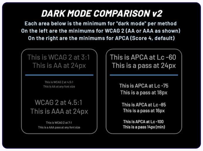
Prima Facia Evidence and Public Comment
Outside of the peer reviews, third party reviews, and the extended 2.5 years of public beta test data collected thus far, you as a user can make your own judgements, using the tools and inspecting the results.
For instance, look at the following examples of minimum compliance for content for WCAG 2 (left) and APCA (right). Which one would you rather defend in a court of law? Which one would you rather sites followed?
Public Comment and Discussion
Public comment and discussion is encouraged. The APCA discussion forum is alive and well, please join in the discussion, share and discuss your findings during the open public test period.
More About APCA, Direct from the Creators
The easy quickstart to becoming an expert in perceptually uniform contrast guidelines.
- Easy Intro to APCA is a good a quick start
- Linktree of essential resources a short, curated list of links
- The Realities And Myths Of Contrast And Color Published by Smashing Magazine. A brief but comprehensive primer to vision, color, and contrast for design, with an emphasis on typography, readability, and visual accessibility needs.
Lead Researcher’s Discussions on WCAG 2 and APCA
The following articles, blogs, gists, and documentation written by APCA Lead Researcher A.Somers, examine the technical and functional differences between APCA and WCAG 2. Note that some of these may be work-in-progress pre-prints relating to ongoing research.
-
Better Reading on the Web Published by UX Collective, this article discusses and demonstrates issues with automated testing and WCAG 2 contrast math, methods, and guidelines.
- The Tangled Web tech blog (TangledWeb.xyz):
- Please Stop Using Grey Text This popular article debunks one of the worst myths regarding design contrast.
- What’s Red & Black & Also Not Read? examines the nature of color insensitivity and readability.
- A Contrast of Errors looks at the history of WCAG 2 and the current international readability crisis.
- Contrasting Theories Background on the first two years of APCA R&D.
- GitHub Gists (gist.github.com/Myndex):
- Part I: Orange You Wondering About Contrast? Answering some contrast questions, and demonstrating a real solution to the infamous orange conundrum.
- Part II: The Lighter Side of Dark Backgrounds An article comparing some parts of APCA with the old WCAG 2 contrast methods, demonstrating how WCAG_2 contrast does not help color vision types.
- Part III: WCAG 2 vs APCA Contrast Shootout Answering some recent questions regarding APCA, with comparisons and examples of the old (WCAG 2 1.4.3) and the future WCAG 3 / APCA.
- GitHub Repos:
- SAPC-APCA Main Documentation Repo This is the primary repo for documentation, discussion, posting issues.
- IRT ARC - Inclusive Reading Technologies The IRT GitHub repo for the APCA Readability Criterion.
- apca-intro comparison discussion This is the corrected fork with detailed discussion.
- apca-w3 The APCA version to be licensed for use with public guidelines such as IRT-RC, WCAG3, and others.
- BridgePCA A simplified version of the APCA math to bridge from WCAG_2 contrast math to the future, while being 100% backwards compatible with WCAG_2 contrast.
- DPS Contrast aka deltaPhiStar 𝜟𝜱✴︎ (Delta Phi Star) is a variant method of determining lightness contrast, and a sibling of APCA and SACAM. It is a simplified version using easily invertible standardized maths
- ColorParsley A lightweight but versatile Myndex MicroColor Library, to parse color strings, objects, or numbers, returning a simple rgba array, and related string utilities. This was developed as part of the basic APCA package.
- SeeStars SeeStars is a Myndex MicroColor Library. This has standard functions for the standard (piecewise) IEC conversion of sRGB to Y, and the CIE standard Y to L* (Lstar) and back again. The math & constants here reference those of CSS 4 for compatibility.
- MaxContrast Send it the background color, returns black or white whichever is maximum Lc value. See also FancyFontFlipping for the related interactive experiment.
