APCA
APCA
⇦ HOME ⇧ UP ONENew to APCA and Pereptually Uniform Contrast?
- You may want to read this Easy Intro first. This is a brief, straight forward, plain-language primer for APCA and readable contrast that you’ve been looking for.
APCA • SAPC • SACAM DOCUMENTATION REPOSITORY
Please make all comments or discussions here and not in the satellite repositories.
Accessible Perceptual Contrast Algorithm
APCA™ is a new way to predict contrast for text and non-text for content on self illuminated displays. This repository is for the documentation, for issue tracking, and for the discussion forum.
TOOLS
CODE
The correct code to use is apca-w3 which is in its own satellite repository, and is also available at npm i apca-w3 That is the only code that should be used for any development purposes.
DESIGN GUIDELINES
The draft independent APCA Readability Criterion is up as a work in progress, still sections to be added and/or adjusted.
FORUMS
For comments or questions on theory, math, or the APCA algorithm itself, please use the SAPC-APCA forum here, please post all comments, questions, or discussions regarding theory, math, code, third-party tools,third-party tools, and so forth, here and not in the satellite repositories, so they can be tracked and resolved.
DOCUMENTATION
Simple Overview, QuickStart, and FAQ
These are intended for end users, and those interested in a plain language overview without a lot of the math & theory.
- Easy Intro to APCA? This is the simple plain-language introduction to APCA that you’ve been looking for. This is a simpler version of WhyAPCA below.
- Why APCA? This brief introduction into APCA describes how it solves the problems of WCAG_2 contrast. See Easy Intro to APCA? for the plain language version.
- APCA in a Nutshell Basic overview for using APCA, including simple use-case based conformance levels.
- APCA FAQ APCA Frequenty Asked Questions (in development)
Sciencey Stuff!
Maths! Vision Science! Photons on Parade!
- The base APCA-W3 formula in LaTeX math for your viewing and calculating pleasure.
- Regarding Exponents Some notes and explanation regarding the power-curve exponents.
- Standard Observer Model Draft standardized environment.
- Visual Contrast Draft Whitepaper (Work in progress)
- Color Vision Links & Resources
For Developers
- RepoList of the related satellite repositories.
- Important Change Notices mainly breaking changes listed here.
- How to Contribute 🎶help us if you can🎵
- A License to calc.
- Minimum compliance to use “APCA” and related trademarks.
Related Repositories
- APCA W3 Repository The code for the W3 version for web content
- Bridge PCA Repository Bridge PCA - the WCAG 2 compatible version
- Color Parsley Repository Fast and easy color string parsing — a NodeJS dependency for many of the SAPC libraries.
THIS REPOSITORY, and apca-w3 ARE THE ONLY CANONICAL SOURCES OF APPROVED APCA CODE.
Bridge PCA
Do you want to improve readability, but you are forced to used WCAG 2 contrast to the letter? Then Bridge PCA is for you. It is backward compatible with WCAG 2, but using APCA technology. SEE: Bridge PCA Repository
W3 Licensed Files Moved
All files that are part of and licensed to the W3 and AGWG, in support of WCAG 3, are now in their own repository.
SEE: APCA W3 Repository and please source all files for tools intended for WCAG 3 conformance from that specific repository. The files in this repositiory are part of other projects, and not necessary for WCAG 3 compliance.
Got Questions? We Got Answers!
- Open a discussion today!
Accessible Perceptual Contrast Algorithm in a nutshell
APCA was developed independently as a part of the future WCAG 3 standards, with the guidance and oversight of members of the W3 AGWG, Members of the US Access Board, and members of the accessibility community at large. All participants, beta testers, early adopters, are deeply thanked for their continuing comments and contributions to the development of the APCA. Readability is for all!
- APCA uses modern vision science and is perceptually uniform.
- Studies demonstrate that APCA provides a perceptually uniform value representing lightness contrast for text on self-illuminated displays.
- APCA can be used today as an independent standard to provide excellent guidance for contrasts for readability and understandability of web content.
- While WCAG 3 is not an official standard yet, it is useful to recognize that APCA substantially improves accessibilty and visual readability. There are some edge cases that may not be fully backwards compatible with WCAG 2.x, due to substantial inaccuracies with the older wCAG 2.x methods and math.
- This is only an potential issue if you have a contractual obligation or strict requirement that demands WCAG 2 AA be followed to the “absolute letter” even when it is wrong.
- APCA guidelines fully exceed WCAG 2 A level, in most cases† exceed the AA level, and APC-RC Silver and Gold levels are functionally improved compared to the old AAA level.
- Unfortunately WCAG 2 contrast math is substantially inaccurate in relation to human perception.
- This is because WCAG 2 is based on now obsolete standards and technologies.
- It is due to this that APCA was developed as the replacement for use in WCAG 3.
- As a result complete backwards compatibility is not possible.
- The discussion tab is open here if you have questions or comments.
- This apca-w3 repo includes the basic APCA code, which returns a perceptually uniform contrast value, and supporting functions, as a public beta for non-commercial use and testing only.
- The apca-w3 repo has the pre-release public beta which is intended to eventually be licensed under the W3C license.
- This iteration has been stable since February 2021, future iterations are planned and in development, primarilly for feature enhancements.
- While it is still a public beta, the general functioning is demonstratively useful.
- This version defaults for sRGB, with additional built-in presets for the Display P3 and Adobe98 color spaces.
- Any display-referred color space can be added as an input module.
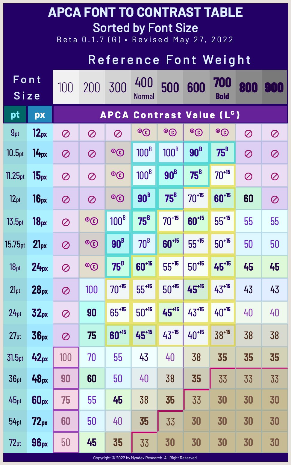
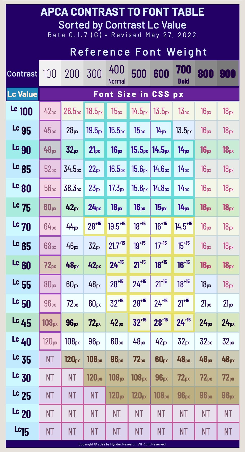
- You can use APCA simply to evaluate a perceived contrast (such as Lc 75). But also:
- There are a variety of lookup tables that can be used to relate a contrast to a recommended font size and weight.
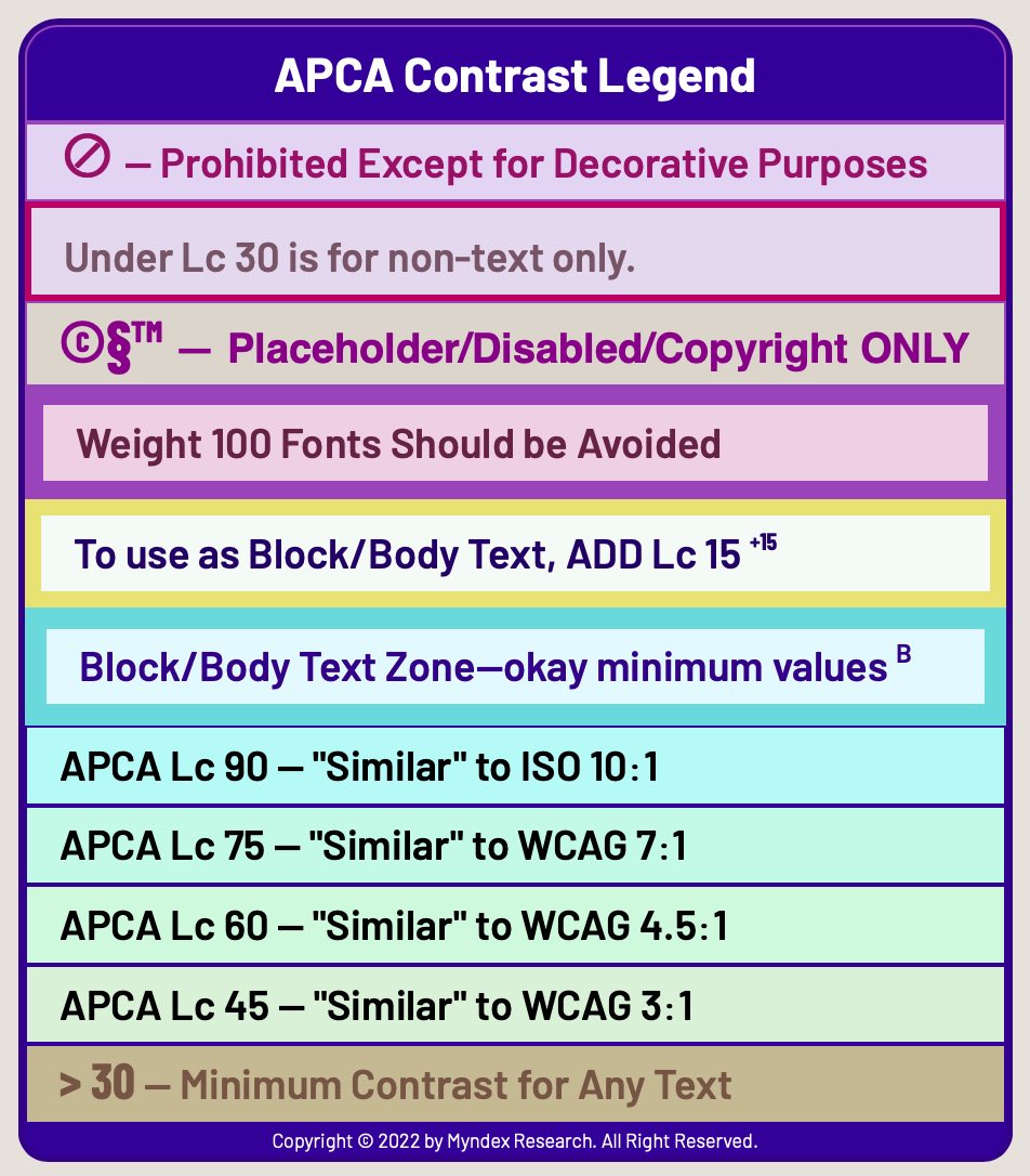
- Rounding the contrast to nearest whole number is allowed, and interpolation can be used with a lookup table.
- For a simple comparison to WCAG 2 contrast, using a light background, and font sizes as noted:
- Lc 60 exceeds 3:1 (in light mode. Use a 24px or larger font for APCA compliance)
- Lc 75 exceeds 4.5:1 (in light mode. Use an 18px or larger font for APCA compliance)
- Lc 90 exceeds 7:1 (in light mode. Use an 16px or larger font for APCA compliance)
- These are for comparison purposes only, and should not be used as conformance levels or design guidance.
- WCAG 2.x contrast can not calculate for dark mode correctly, therefore no useful comparison can be made.
- Unlike WCAG_2, APCA is polarity aware, so the BG and TEXT colors must be sent to the correct inputs for accurate contrast prediciton.
- However, if backwards compatibility is required, then the non-polar mode can be used.
- For non-polar mode, send the darkest color to the text input, and lightest to the background input, regardless of which is used for text or background.
- In this mode, Lc 60 exceeds WCAG 2.x “3:1” and Lc 75 exceeds WCAG 2.x “4.5:1”, as noted above.
- However, in this “foreced backwards” mode, much of the added design flexibility of APCA may be lost.
- However, if backwards compatibility is required, then the non-polar mode can be used.
Please feel free to use the discussion area for any questions or comments.
†Note: in the few areas where WCAG 2.x may reject dark mode colors that APCA passes. These colors should not be rejected, as they are particularly helpful to those with color vision deficiencies, and WCAG 2.x is in error.
Why APCA
See WHY APCA for a brief plain language explanation of the important differences of APCA for WCAG 3 vs the old WCAG 2.x/1.4.3 contrast guidelines.
SAPC and APCA demo tools are live to play with.
The basic simple version is the APCA page, it includes the new scaling and the dynamic font matrix. The is the official WCAG3/Silver support version.
APCA is the Accessible Perceptual Contrast Algorithm
APCA is a set of contrast assessment methods for predicting perceived contrast between sRGB colors on a computer monitor. It has been developed as an assessment method for W3 Silver/WCAG3 accessibility standards relating to content for computer displays and mobile devices.
BASIC FEATURES
- Incorporates Spatial Frequency & Stimulus Size directly in predictions.
- Spectral weighting of luminance based on sRGB coefficients as default.
- DisplayP3 and AdobeRGB input modules built in as options.
- Separate weighting for normal and reverse polarity (dark text on light background vs light text on dark, aka dark mode.)
- Estimation and weighting of typical light adaptation for perceptual uniformity in a common “standard observer” model (see below).
- Spatial frequency considerations for font weight as part of calculations and further defined in a lookup table. (I.e. values Lc 60 and higher are weighted for fonts less than 24px, values less than Lc60 are weighted for large fonts and non text).
- Lookup table can be customized for different languages/character sets.
LIVE VERSION apcacontrast.com
There is a working version with examples and reference material on APCA site
Font Use Lookup Tables
Latest Lookup Table: May 27 2022
THIS REPOSITORY, and apca-w3 ARE THE ONLY CANONICAL SOURCES OF APPROVED APCA CODE.
If you are integrating code, please check here for official changes, or at apca-w3 for the W3 licensed version. This code is considered beta, and will change periodically. The repo for WCAG_3 compliance is apca-w3.
Source and Data
Please do not use anything in the legacy branch here without contacting us first. All the useable source is at the APCA–W3 repo or in the NPM package npm i apca-w3
IMPLEMENTATIONS
The base libraries are plain vanilla Javascript. Other languages may be in the “PORTS” folder. Many of the available inputs to the functions can remain at their defaults, though these extra inputs can be used in more specialized situations (such as creating content specifically for daylight/outdoors, or specifically for dark nights, etc.).
A plain language walkthrough, LaTeX math, and related supporting information is below:
APCA 0.1.9 4g constants and math
APCA is the Accessible Perceptual Contrast Algorithm. The math below assumes the use of the web standard sRGB colorspace.
 // 0.98G-4g full range version constants:

  Exponents =  { mainTRC: 2.4,       normBG: 0.56,       normTXT: 0.57,     revTXT: 0.62,     revBG: 0.65, };

  ColorSpace = { sRco: 0.2126729,    sGco: 0.7151522,    sBco: 0.0721750, };

  Clamps =     { blkThrs: 0.022,     blkClmp: 1.414,     loClip: 0.001,     deltaYmin: 0.0005, };

  Scalers =    { scaleBoW: 1.14,     loBoWthresh: 0.035991,  loBoWfactor: 27.7847239587675,  loBoWoffset: 0.027,
                 scaleWoB: 1.14,     loWoBthresh: 0.035991,  loWoBfactor: 27.7847239587675,  loWoBoffset: 0.027, };
The Plain English Steps Are:
- Convert the sRGB background and text colors to luminance: Ybackground and Ytext
- Convert from 8 bit integer to decimal 0.0-1.0
- Linearize (remove gamma - shown in next step by applying a ^2.4 exponent
- Apply sRGB coefficients and sum to Y
- Y = (R/255)^2.4 * 0.2126 + (G/255)^2.4 * 0.7152 + (B/255)^2.4 * 0.0722
- We will call these Ytext and Ybackground
- Determine if Ytext or Ybackground is brighter (higher luminance, for contrast polarity)
- Soft-clamp the colors but only if it is less than 0.022 Y
- Soft Clamp: subtract the color Y from 0.022
- Then apply a ^1.414 exponent to the result
- Then add that result back to the Y of the darker color
- clampedY = ( 0.022 - Y )^1.414 + Y
- Soft-clamp the colors but only if it is less than 0.022 Y
- Apply power curve exponents to both colors for perceptual contrast
- For dark text on a light background, use ^0.57 for Ytext and ^0.56 for Ybackground
- For light text on a dark background, use ^0.62 for Ytext and ^0.65 for Ybackground
- Subtract Ytext from Ybackground
- Always subtract the Ytext value from the Ybackground value ( BG - TXT )
- For light text on a dark background, this will generate a negative number.
- This is intentional, so that negative values indicate light text on dark BGs, and positive values only indicate dark text on a light BG.
- Always subtract the Ytext value from the Ybackground value ( BG - TXT )
- Multiply by the scale 1.14
- THEN if the absolute value is less than threshold 0.1 return “contrast too low”
- ELSE if positive, subtract the offset 0.027 and then multiply by 100 for Lc
- ELSE if negative, add the offset 0.027 and then multiply by 100 for Lc
- Finally: compare the Lc value to the font lookup table for the language being used to determine the minimum font size and weight.
Basic APCA Math in LaTeX
0.0.98G-4g-base W3 (apca-w3 0.1.19d) Reverse (bottom up) Notation
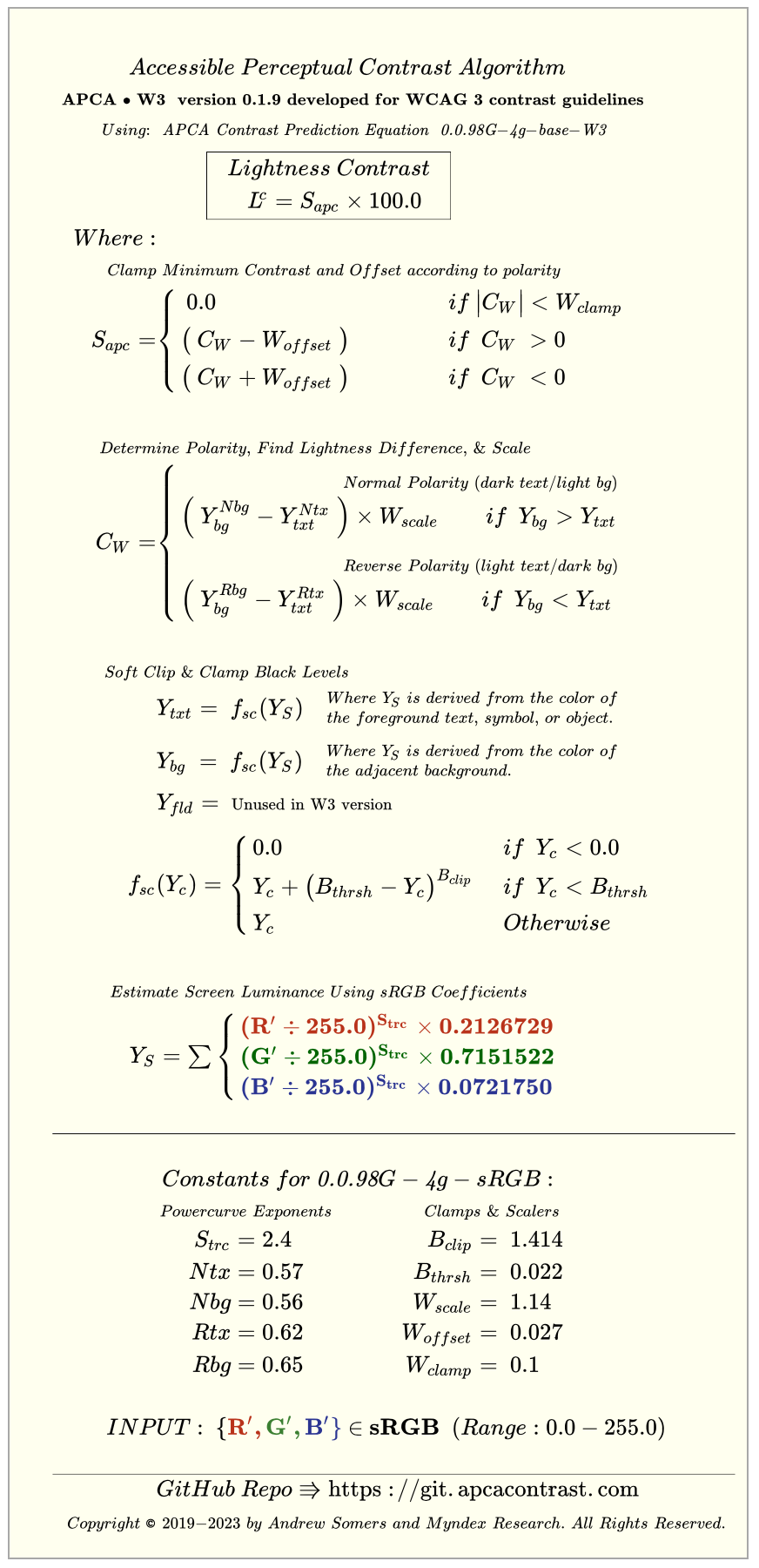
0.0.98G-4g-base W3 (apca-w3 0.1.19d) Standard (top down) Notation
NOTICE: “APCA is a method for predicting text contrast on self-illuminated displays for web-based content. Some use-cases are prohibited by license, including the following: use in medical, clinical evaluation, human safety related, aerospace, transportation, military applications, are strictly prohibited without a specific license in writing granting such use.”
TESTING YOUR IMPLEMENTATION
If you’ve implemented the code and want a quick sanity check, Here are some keystone checks with no rounding. The first color is TEXT and the second color is BACKGROUND:
Test Values for APCA W3 using the G series constants, normal and reverse float values for each color pair.
First number is TEXT second number is BACKGROUND.

    TEXT vs BKGND •  EXPECTED RESULT for APCA W3 to 0.1.9 (G-constants)

    #888 vs #fff  •  63.056469930209424
    #fff vs #888  • -68.54146436644962

    #000 vs #aaa  •  58.146262578561334
    #aaa vs #000  • -56.24113336839742

    #123 vs #def  •  91.66830811481631
    #def vs #123  • -93.06770049484275

    #123 vs #444  •   8.32326136957393
    #444 vs #123  •  -7.526878460278154

The below are only for certain experimental low-scale versions, these tests do *not* acpa-w3:
    #123 vs #234  •   1.7512243099356113
    #234 vs #123  •  -1.6349191031377903
These exercise all the important constants.
Miscellaneous
THIS IS BETA
Being developed for use with future web standards for accessibility. Those standards are under separate repositories with the W3/AGWG.
OTHER RESOURCES
The Myndex APCA Linktree
- A small list of links relating to APCA contrast and color. The more basic, plain language documents and articles at the top, and then lower on the link list, incresingly technical resources.
The Myndex Color and Contrast Resource Page
- A much larger list than the linktree. How deep do you want to jump down this rabbit hole?
DISCLAIMER
DISCLAIMER AND LIMITATIONS OF USE:
APCA is an embodiment of certain supra-threshold contrast
prediction technologies. Versions marked as licensed to
the W3 are strictly limited to web content use only for
supporting certain accessibility guidelines.
APCA code listed here is provided as is, with no
warrantees expressed nor implied. We accept no
liability for any use or misuse of the code.
Suitability of purpose resides with the
integrator or end user.
Commercial use is prohibited without a written
and signed commercial license agreement.
Non-commercial use is permitted only for
predicting contrast for web content, no
other use case is authorized.
License excludes other use cases not related to web
content. Prohibited uses include and are not limited
to medical, clinical evaluation, human safety related,
aerospace, transportation, military applications, and
uses which are not specific to web-based content
presented on self-illuminated displays or devices.
Glossary
- Light — visible light is energy in a narrow range of frequencies or wavelengths that can be detected or sensed by “photo sensitive cells” in the back of the eye.
- Color — color is not real, but a perception or interpretation by visual processing in the brain (in the brain’s visual cortex) of stimulus from photosensitive cells in the eye.
- Hue — refers to a particular color sensation, i.e. red, green, yellow, blue, etc. Hue does not exist in reality, it is solely the perception of the visual system responding to light of different frequencies.
- Saturation — the color intensity or purity, reduced by:
- tint (add white),
- shade (add black),
- tone (add grey),
- Brightness — a relative perception, see also perceptual lightness.
- Luminance (Y or L) — a physical measure of visible light intensity. Luminance is mathematically linear as light is in the real world.
- Perceived Lightness
(L*)— the perception of physical light intensity. Perceptual lightness is mathematically nonlinear in regards to light in the real world, however, some perceptual models attempt to provide a mathematically linear version of perception which then presents light as non-linear. The symbol L* refers toCIE L*a*b*, and should not be confused with luminance L. - Luma (Y’ prime) — is a gamma encoded, weighted signal used in some video encodings. It is not to be confused with linear luminance.
- Gamma — or transfer curve (TRC) is a curve that is commonly applied to image data for storage or broadcast to reduce perceived noise and improve data utilization.
- Contrast — is a perception of the difference between two objects/elements. There are many forms of contrast, and the different types of contrast interact with and are affected by each other as well as being affected by other aspects of vision.
- Lightness contrast: the difference in lightness and darkness between two items. This is a particularly important form of contrast for information such as text.
- Spatial contrast: in other words contrasts of size. Size contrasts directly affect the perception of lightness contrasts.
- Hue contrast: the perception of different light frequencies. Hue contrasts are three times weaker than lightness contrasts, and some people have problems perceiving some hues, so hue should never be a primary design contrast.
- Positional contrasts: the distance and/or orientation between objects is important in object recognition and identification.
- Temporal contrasts: contrasts of time, speed, and change.
- Visual Acuity — acuity refers to the ability of the eye’s optics to focus light onto the photoreceptors on the back of the eye.
- Poor acuity is usually understood as blurry vision or an inability to focus.
- Spatial Frequency — in a practical sense, this refers to the weight of a font, or the stroke width. A thinner font or narrower stroke width is a higher spatial frequency than a bolder or thicker stroke. Higher spatial frequencies require more luminance contrast to be visible than lower frequencies, such as a very bold large headline.
Change Notices:
If you have been using any files from this repository, be sure to read the file “ImportantChangeNotices.md” for critical updates that may affect results.
SAPC/APCA CURRENT VERSION: 0.1.9 Constants: 0.0.98G-4g
January 27 2022
Font lookup table revised, now LUT ver 0.1.5 G constants. New the arrays in the data folder. More uniform response across multiple font families, and improved acuity weighting.
January 18 2022
Font lookup table revised, still for 4G constants. Tighter conformance now.
January 2 2022
Font lookup table revised, still for 4G constants.
December 1, 2021
All W3 licensed files moved to their own repository, AND
A new npm package has been released (of the W3 version) to ease integration!!
November 23, 2021
Adopting semantic versioning, adding a first 0. so the current version is 0.0.98G
November 17, 2021
Please see the new font lookup table (LUT3) (on this page, below)
October 1, 2021
The base APCA with the 0.0.98G-4g constants is in the JS folder.
NEW CONSTANTS and NEW MATH:
(October 1, 2021) the 0.0.98G-4g math and constants have been in use now for months, and by all accounts are working well as expected. The revised code is available in the JS folder. The present version improves tracking of contrast perception. (Doubling or halving the Lc value results in a perceived doubling or halving of contrast.) Also, smoother results for low contrasts and dark color pairs.
Accessibility Statement for Beta Sites
At their option, beta testers, early adopters, and sites using APCA to determine text and non-text contrast may wish to include the following statement in their site’s boilerplate:
APCA Accessibility Statement v0.1.9
This website is beta testing the APCA guidelines for determining text and non-text contrast. It is well known that WCAG 2 contrast maths and methods are not accurate regarding human perception of text, as a result automated testing using WCAG 2 maths may incorrectly indicate errors in some color pairs on this site. The APCA guidelines are a substantial improvement in accessibility over WCAG 2 contrast criterions, and therefore compliant with the ADA. Compliance with US Access Board 508 rules is per the alternative methods section. Compliance in other jurisdictions subject to evaluation. Any automated testing done to determine conformance of this site must be conducted using a perceptually accurate method of predicting text contrast, such as APCA. WCAG 2.x math, methods, and success criterion are notwithstanding.
This Site is Tested With APCA-W3 Version: < insert valid guidelines version here >
End Accessibility Statement
For giggles:
More glossary of confusing terms and “bonus sciencey stuff” in The Lighter Side of Light
THE REVOLUTION WILL BE READABLE™
Disclaimer: APCA is being evaluated as a replacement for WCAG 2 contrast math for future standards and guidelines, however, standards that will be incorporating APCA are still developmental. Because WCAG 2 contrast math does not accurately model human visual perception nor visual impairments, there will be discrepancies between WCAG 2 contrast math, and perceptually uniform models such as APCA. It is up to the end user to determine suitability of purpose for their region and conformance requirements.